For creative directors, art directors
and the AI they brief
Save the images, clips and interfaces you love. The Taste Index works out why you love them, sorts them into styles, and turns each style into a skill your AI follows when it designs for you.
Works with Codex · Claude Code · Cursor · any MCP app
Save anything that moves you.
Stills, clips, interfaces, type, film, fashion, cars, buildings. One archive for every discipline.
Keep. Pass. Fast.
What you upload already counts as kept. Then it shows you near-misses of your own references, almost right or pure slop. Every pass draws the edge of your taste.
It reads why it works.
Every kept reference gets a breakdown: composition, light, palette, type, and for clips, the timing and easing of the motion.
Sort it into styles.
Group references by look. One image can live in several styles. Each style learns its own rules.
Approve the rules.
The Taste Index proposes what defines each style. You approve, edit or dismiss. Approved rules become a SKILL.md.
Your AI designs with your eye.
Connect Codex, Claude Code or Cursor. Your agent loads the style, writes a DESIGN.md and checks its work against your rules before you see it.
Library
Upload · 9 newFashion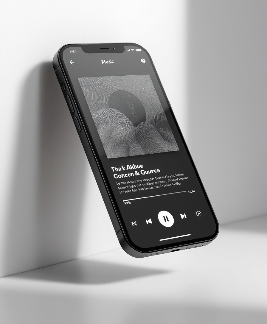 UI
 Architecture
 Editorial layout
 3D and CGI
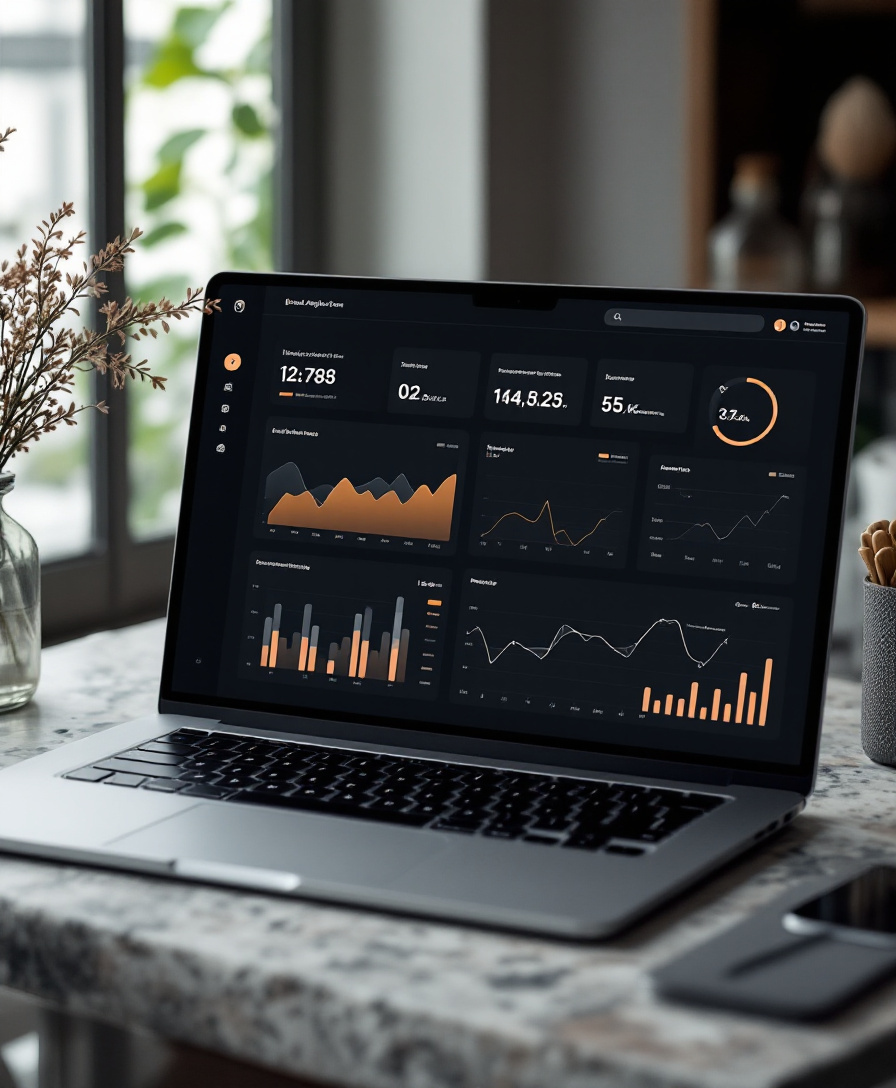 UI
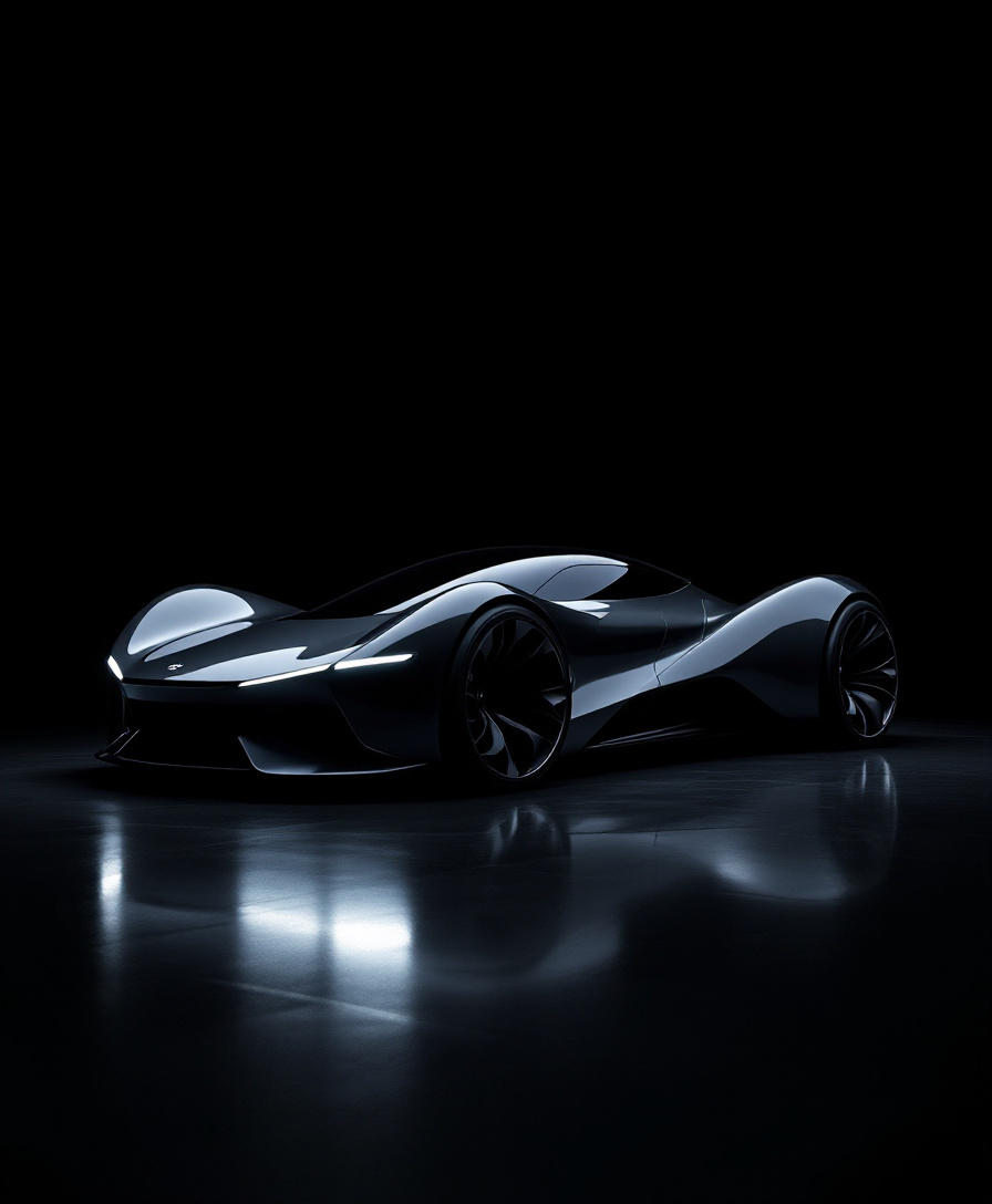 Automotive
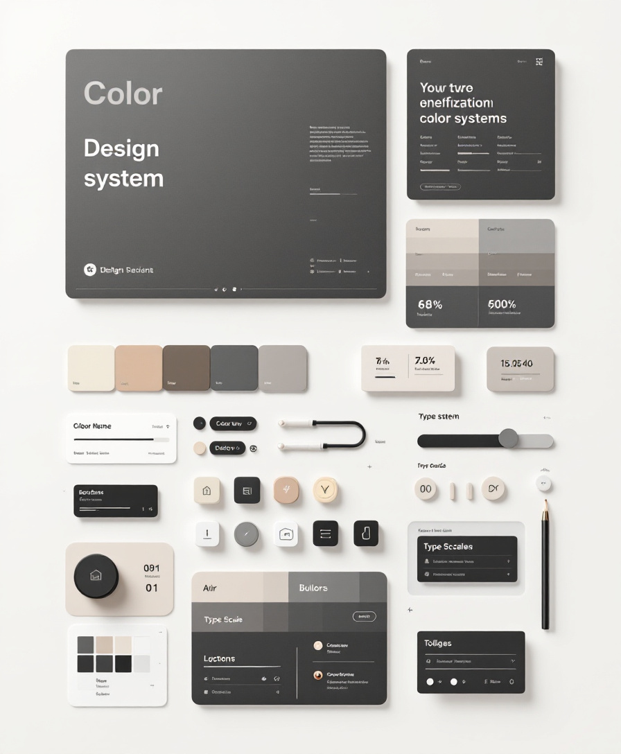 Visual identity
 FilmKeepPassKeepPassKeepPassKeepPassKeepPassKeepPass123
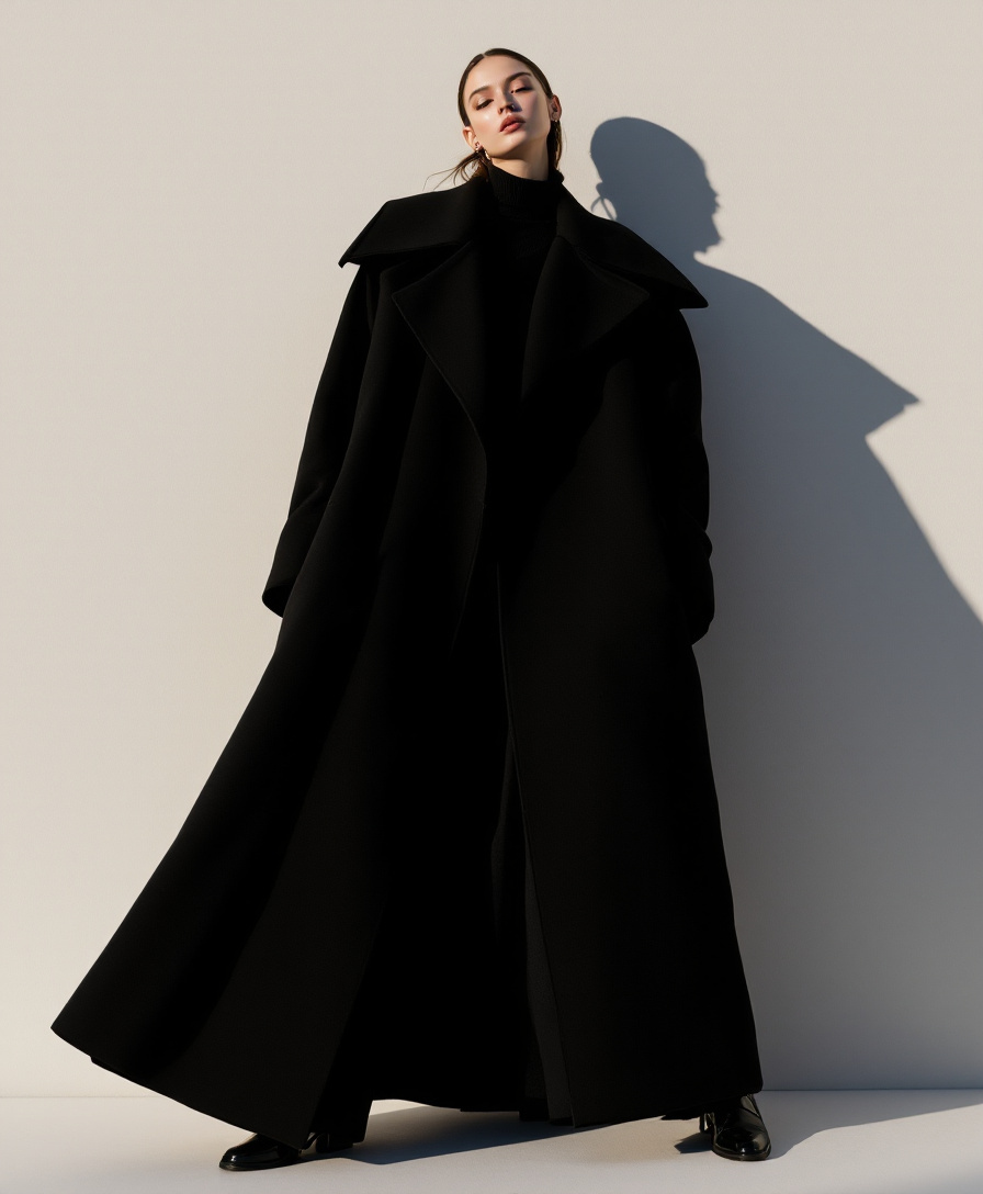
1CompositionSilhouette carries the frame; detail is secondary
2LightShadow used as a second figure
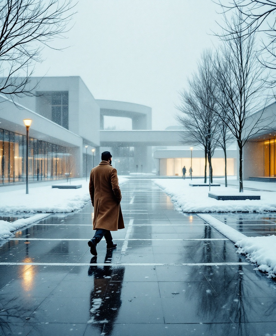
3Why it worksOne hard flash turns the coat into architecture.
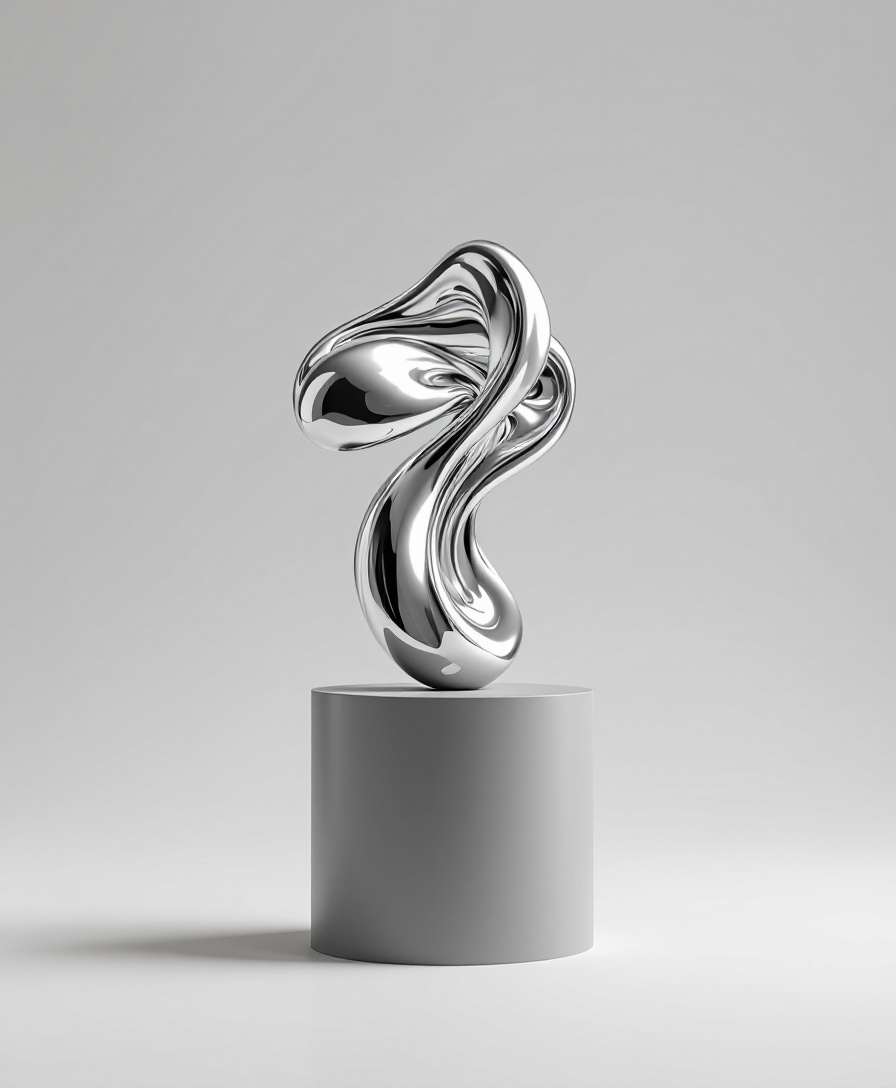
Soft chrome5
Also in Swiss brutalSwiss brutal4
Quiet luxury4
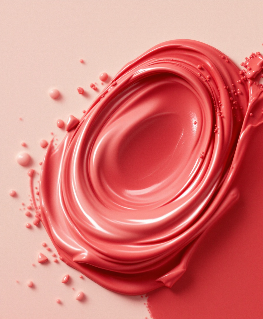
Soft chrome
Treat chrome as light, never as texture.
ApproveOne accent per screen; everything else in three greys.
Approve600ms expo.out on arrival. Nothing bounces.
ApproveAvoid gradients that read as plastic.
Approve- # Style: Soft chrome
- ## The look (approved)
- - Treat chrome as light, never as texture.
- - One accent per screen; everything else in three greys.
- - 600ms expo.out on arrival. Nothing bounces.
- - Avoid gradients that read as plastic.
- ## References · 5
- ## Self-critique checklist
> Landing page for the spring launch, in my Soft chrome style.
→ get_skill(style: “Soft chrome”)
→ create_design_md(domains: [ui, micro-interactions])
Draft ready. Checked against your rules.
New light.
- ✓Chrome as light, never texture
- ✓One accent per screen
- ✓600ms expo.out, nothing bounces
The problem
A mood board shows your AI what you like.
It can’t tell it why.
So the AI averages your references into something generic. Your taste lives in the reasons: the timing of an ease, the one accent per screen, the photo you almost kept but didn’t. The Taste Index captures those reasons and hands them over as rules.
why?why?why?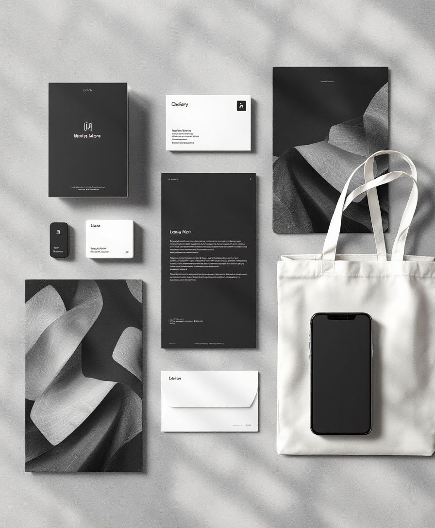 why?
The browser button
Collect from anywhere. Even motion.
Hover any image on any site and press Save. Videos and GIFs save as real clips, and for anything that moves, a hover, a transition, a scroll effect, it records a few seconds. Everything lands in your index, kept and read.
Save▶︎ 0:12Save clip- 01SaveHover any image, press Save.
- 02ClipsVideos and GIFs save whole.
- 03RecordAnything that moves: 3, 2, 1, recording.
- 04ReadIt lands kept, gets read, joins a style.
Why not just a board
Saving is the start, not the point.
| Bookmarks | Inspiration boards | The Taste Index | |
|---|---|---|---|
| Saves references | ✓ | ✓ | ✓ |
| Groups them by look | – | ✓ | ✓ |
| Remembers what you rejected | – | – | ✓ |
| Explains why each one works | – | – | ✓ |
| Reads motion: timing, easing, sequence | – | – | ✓ |
| Turns a look into rules you approve | – | – | ✓ |
| Your AI designs from those rules | – | – | ✓ |
Inspiration from every discipline
Every reference, read.
Photography, interfaces, type, motion, objects. Swipe through. Each one comes with what makes it work.
One hard flash turns the coat into architecture.
- Silhouette carries the frame; detail is secondary
- Shadow used as a second figure
The artwork is the interface.
- One oversized image, controls kept quiet
- Condensed type sets the hierarchy
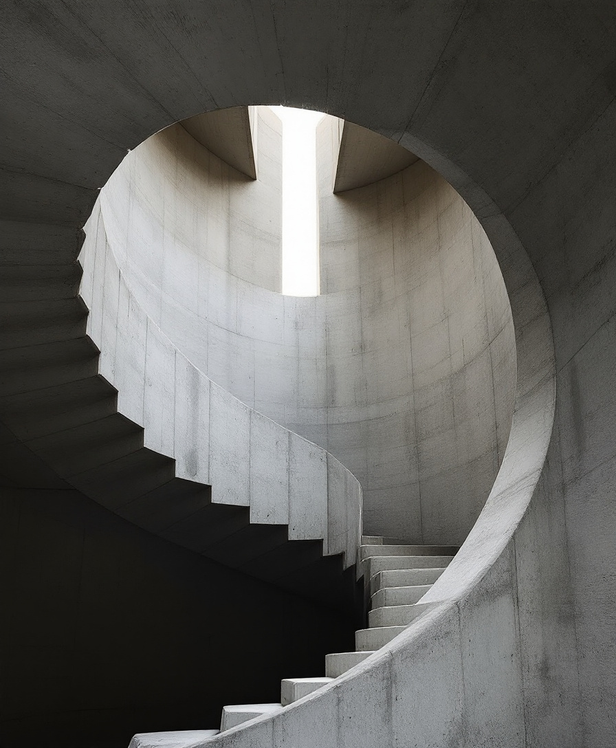
Raw concrete and one slit of light. Nothing else needed.
- Light as the only ornament
- Spiral pulls the eye to a single point
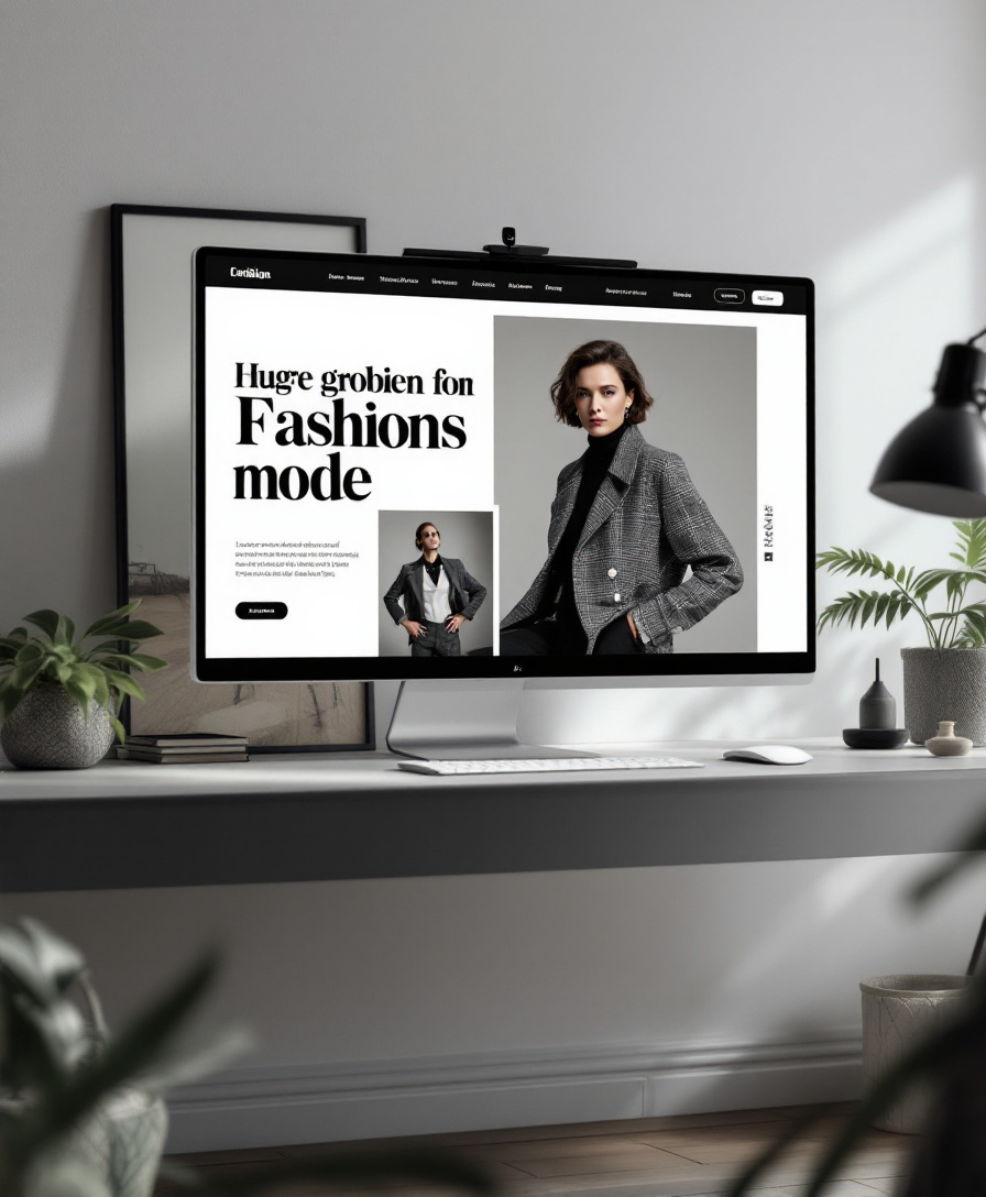
A magazine spread that happens to scroll.
- Full-bleed image against a strict grid
- Headline scale does the branding
Chrome as light, not as texture.
- Reflections stay soft and readable
- Form frozen at the peak of motion
Data with one accent and a lot of air.
- Large numerals lead, charts support
- A single accent marks what matters
A single rim light draws the whole car.
- One line of light defines the form
- Darkness keeps the silhouette pure
The system, not the screen.
- Type scale shown as a ladder
- Components share one corner radius and stroke
Scale and silence: one figure, a whole plaza.
- Symmetry broken by a single subject
- Muted grade lets the coat be the only warmth
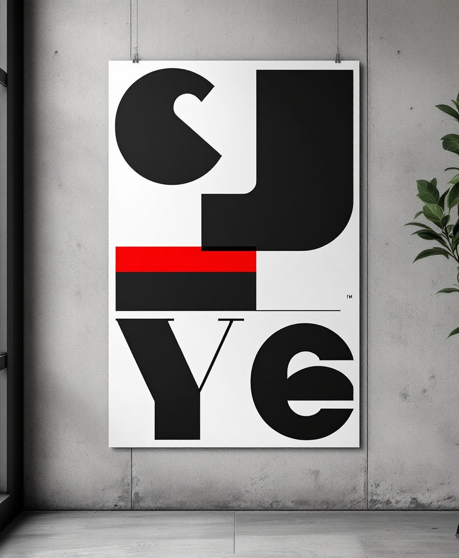
Letterforms as architecture.
- Cropping makes the type monumental
- One color block anchors the grid
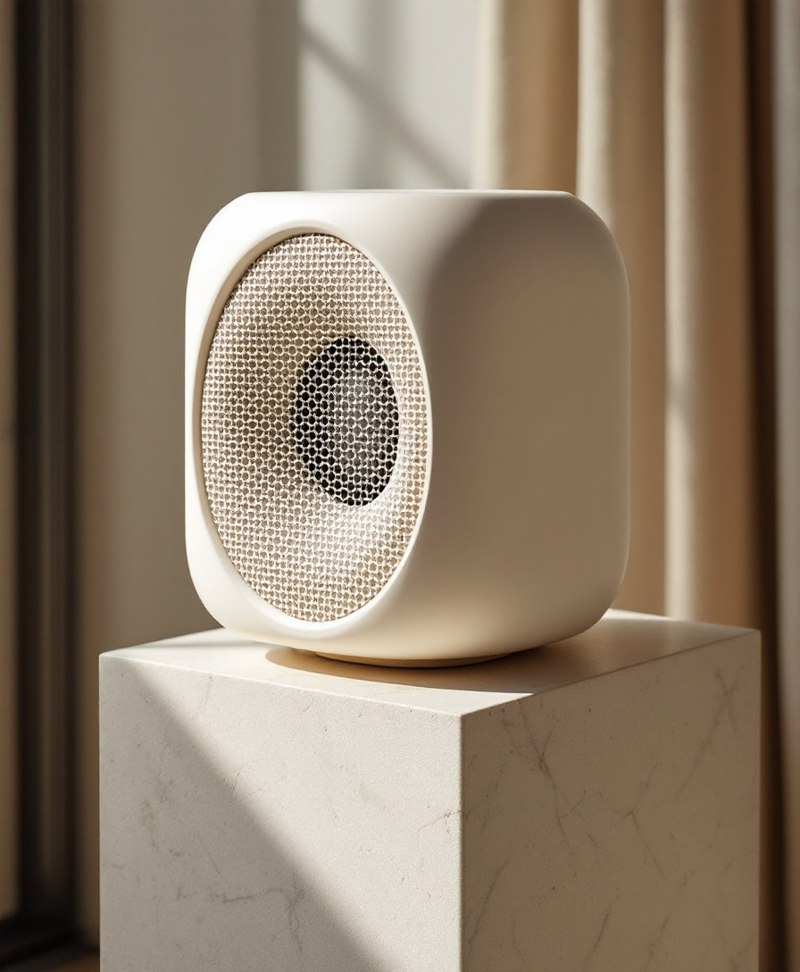
Honest materials, nothing added.
- Grid of perforations as the only pattern
- Travertine warms a cold object
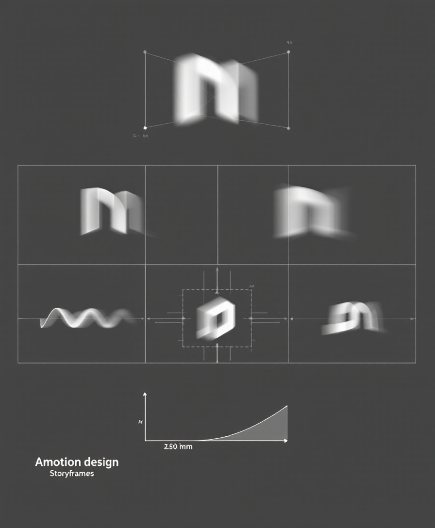
Motion planned like choreography.
- Keyframes read as a sequence at a glance
- Easing drawn next to every move
Texture at the scale of a landscape.
- Macro makes the product feel monumental
- Two tones, one highlight
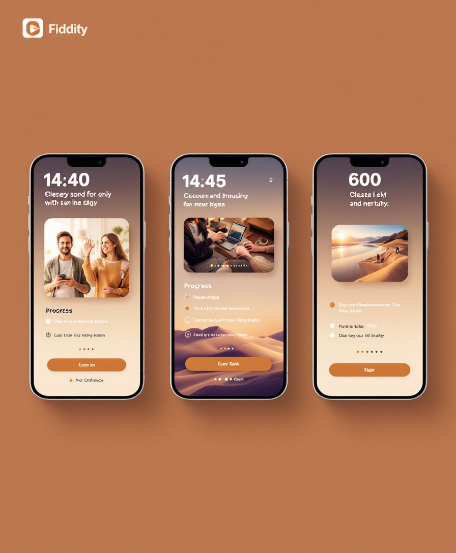
Three screens, one idea each.
- Each step asks for exactly one thing
- Imagery carries the tone, type carries the task
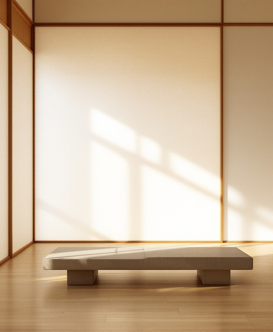
Diffused light does the decorating.
- Emptiness used as a material
- Warm light against pale oak
One mark, held consistent everywhere.
- Monochrome system with a single accent
- Generous margins repeat across every touchpoint
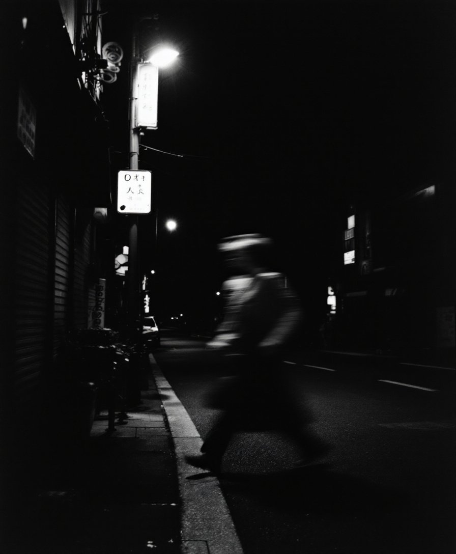
Grain and blur as honesty.
- Motion blur keeps it alive
- Contrast pushed until it becomes graphic

One continuous gesture, eased in and out.
- Easing visible in the curve itself
- Black space gives the motion room
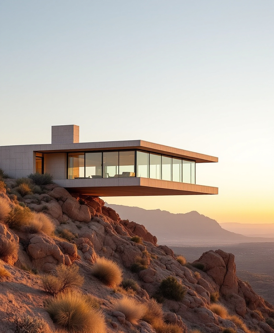
A horizontal line held against the land.
- Cantilever creates tension
- Golden hour warms raw concrete
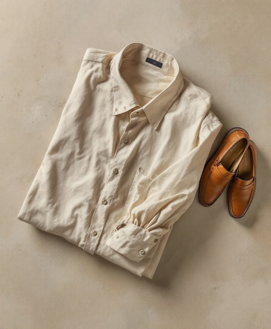
Quiet luxury: texture over logo.
- Neutral palette lets fabric read
- Top-down flatness feels editorial
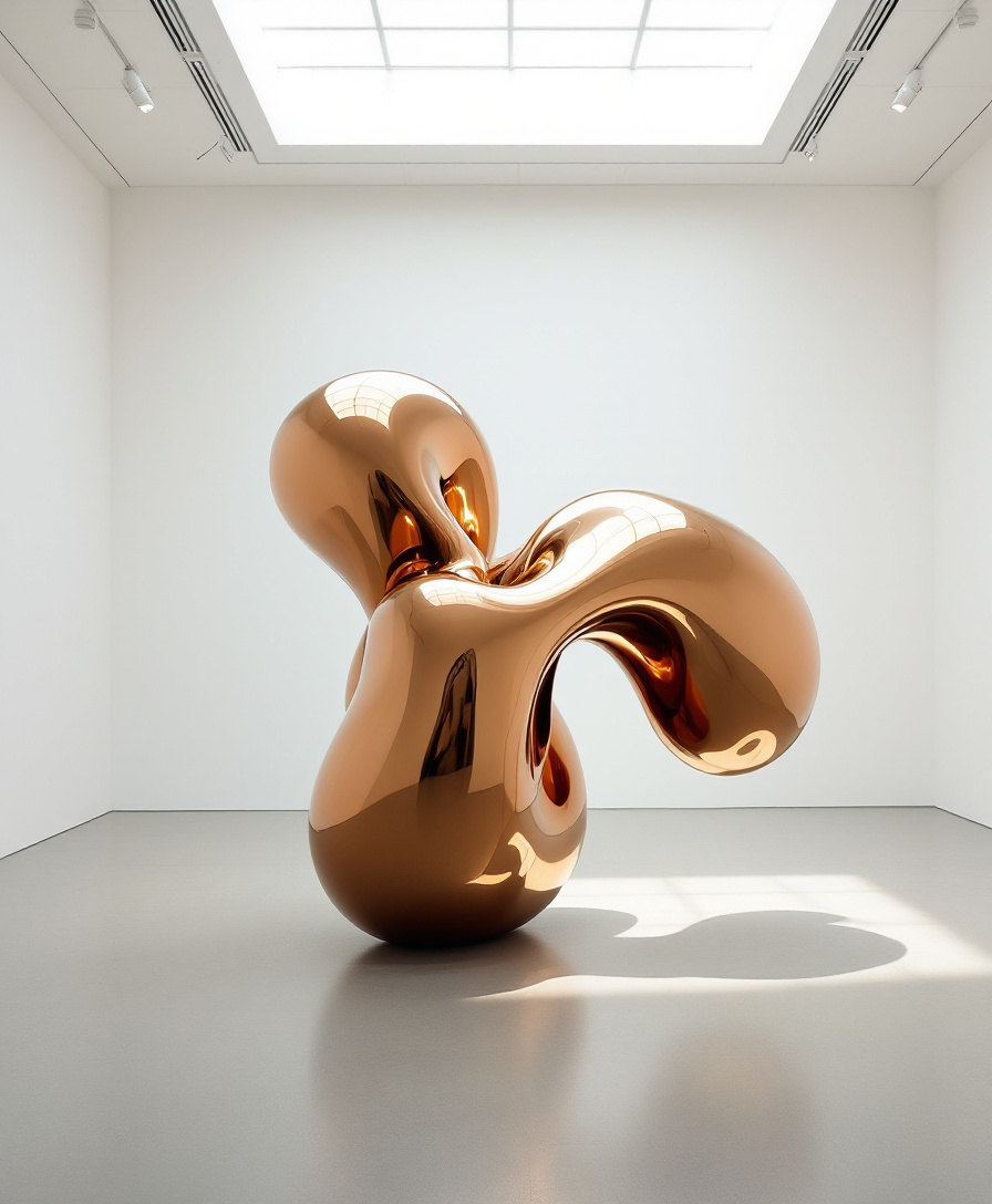
One object, given the whole room.
- Negative space frames the work
- Skylight gives a single clear direction
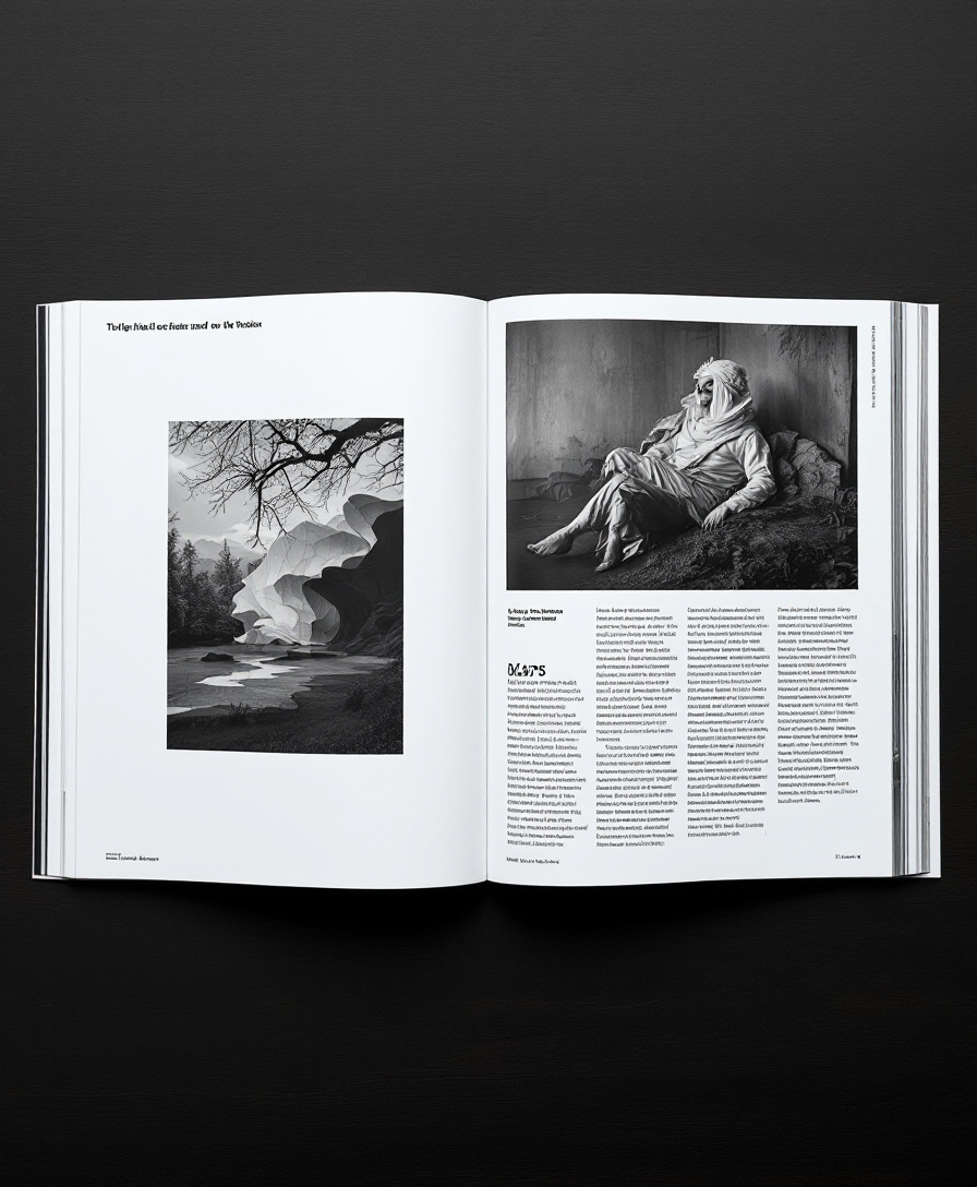
Full bleed against generous white.
- Contrast between image and margin
- Columns set a calm reading rhythm
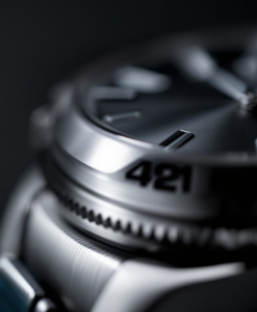
Precision you can feel.
- Shallow focus on the one detail that matters
- Cool grey keeps it technical
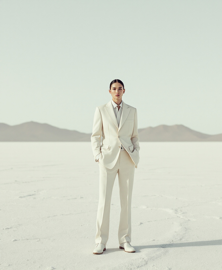
A tiny figure makes the space enormous.
- Scale contrast as the idea
- Ivory on white: tone on tone
Questions
The short version.
- Who is it for?
- Creative directors, designers and motion people who brief AI tools and want the output to look like their work,
not like everyone's. - What does my AI actually get?
- A SKILL.md per style and a DESIGN.md per project: approved rules, what to avoid, reference images with what to borrow from each, and a checklist it critiques its work against before showing you.
- Which tools does it work with?
- Codex, Claude Code, Cursor and any app that speaks MCP.
Skills are plain files, so you can also paste them anywhere. - Is my taste private?
- Yes. Your library, styles and rules are yours.
Only items you choose to share appear in the public game.